PLEASE NOTE: This guide is to reproduce the exact ‘Inigma’ design only. These image sizes are best for optimization. Do not use distorted or blurry images. For best quality use .png images. Before publishing images, please optimize all images with this free tool: https://tinyjpg.com/
RHT v4.0 Inigma Theme requires a number of images for the design. If you prepare these in advance, you will have your new theme up and running in no time.
Main Logo = 240 x 40px
Mobile Logo = 240 x 40px
Favicon = 32 x 32px
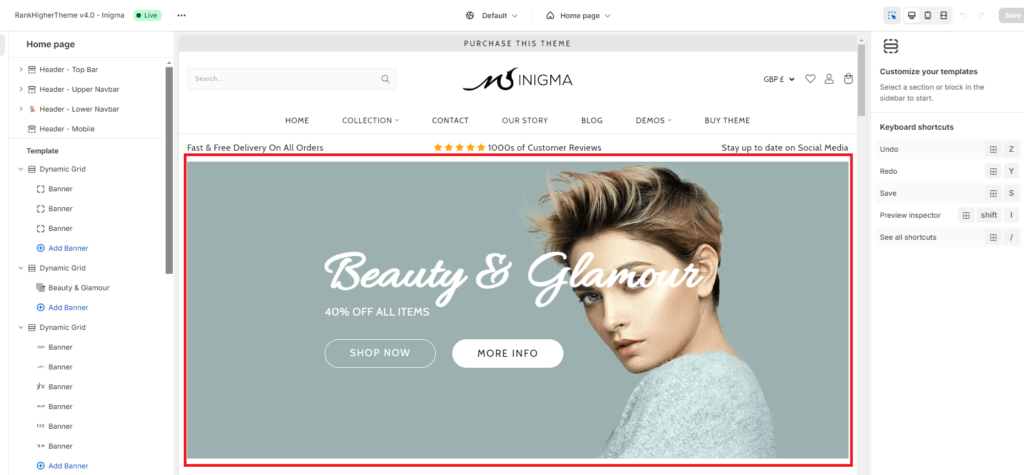
Main Header Banner Image Size = 2100 x 540px (as above)
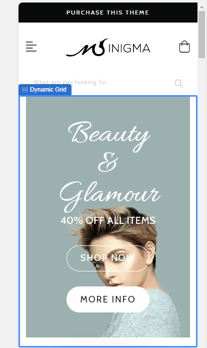
Mobile Main Banner Image = 300 x 450px
Dynamic Grid Banner 1 = 900 x 600px
Dynamic Grid Banner 2 = 900 x 600px
Dynamic Grid Banner 3 = 900 x 600px
Dynamic Grid Banner 4 = 900 x 600px
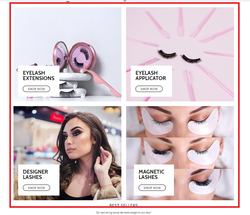
Mobile Dynamic Banner Images 1 – 4 = 300 x 400px


Desktop Parallax (Disabled on mobile for speed) Same as main header – 2100 x 500px

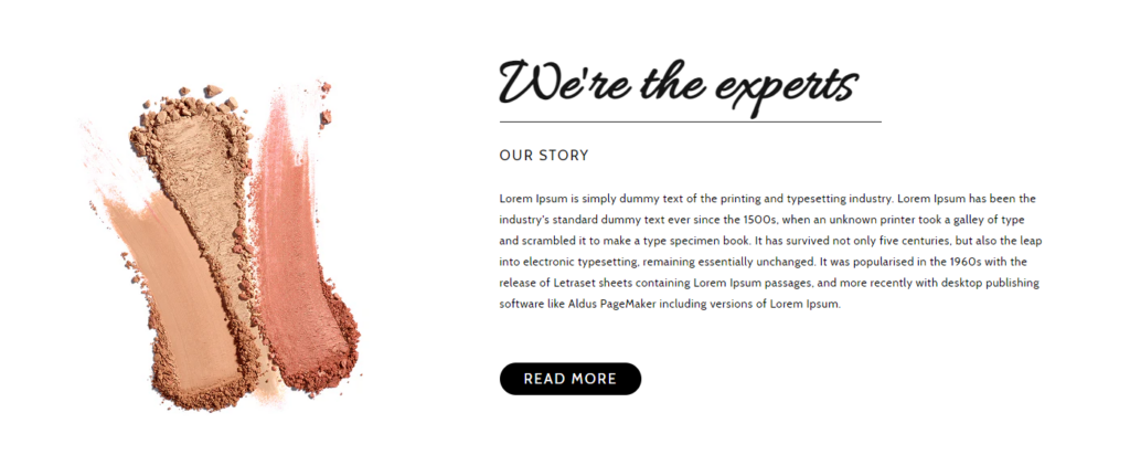
We’re the experts Image Desktop = 570 x 500px
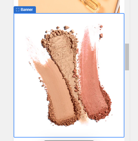
We’re the experts Mobile = 300 x 400px
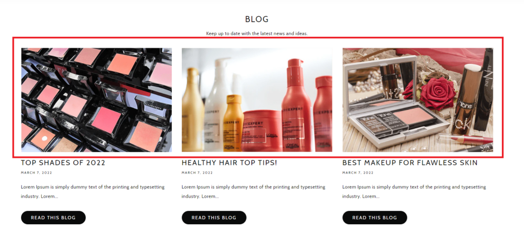
Single Blog Post Images = 1200 x 800px
